Rebranding RAILS
How a Queensland legal service found its identity for the next decade
- Client: Refugee and Immigration Legal Service (RAILS)
- Project: Logo Design and Brand Identity.
- Deliverables: Primary logo, brand mark, colour palette, typography system, stationery suite, social media assets, merchandise guidelines, iconography, brand guidelines document.
- Launch: 1 July 2026
The organisation behind the brief
Refugee and Immigration Legal Service (RAILS) is a Queensland-based community legal centre providing specialist immigration and refugee law assistance to some of the most vulnerable people in our community — refugees, asylum seekers, and migrants navigating complex and often life-changing legal systems.
Their work spans protection visa assistance, family reunion services, legal clinics, community legal education, and status resolution. It is serious, specialist work. And for a long time, their visual identity wasn't keeping pace with it.
The original RAILS logo featured interlocking rounded squares in muted terracotta, teal, and warm grey, a classic early-2000s nonprofit aesthetic that communicated community and connection. Still, it lacked the distinctiveness, scalability, and strategic presence the organisation had grown into. There was no strong standalone brand mark, no colour palette with real authority, and no visual signal of the specialist, future-ready organisation RAILS had become. It looked like a service. It needed to look like a leader.

This was not a cosmetic refresh
From the very first line of the brief, RAILS made one thing clear: this is not a cosmetic refresh. It is a repositioning for the next decade.
RAILS was entering a new phase — strategic maturity, governance reform, digital transformation, and potential service diversification, including education and fee-for-service streams. They needed a brand that could carry that weight. One that would speak with equal clarity to a recently arrived refugee with limited English, a government funder evaluating grant applications, a pro bono law firm considering a partnership, and a corporate sponsor looking for credibility.
The brief asked for a brand that communicated calm competence. Authority and humanity, in the same mark.
That's a genuinely difficult design problem — and exactly the kind I love.
Understanding the audience before touching a sketchbook
Before any concepts were explored, the brief required me to sit with the complexity of who this brand needed to speak to.
- The primary audience — refugees, migrants, and people seeking asylum — often have limited English proficiency and are navigating systems that feel overwhelming and opaque. The brand needed to feel accessible, not intimidating. Warm, not bureaucratic.
- The secondary audience — government funders, philanthropic foundations, corporate sponsors, and pro bono law firms — needed to see an organisation that looked as sophisticated and stable as it actually is. Professionalism. Strategic maturity. Future-readiness.
The brand had to do both simultaneously. There was no room for compromise in either direction.
The brief was equally clear about what to avoid: no scales of justice, no clichéd legal symbols, no imagery of distress or crisis, nothing activist-coded or overly grassroots, nothing corporate or cold.
That left a genuinely interesting creative space to work in.
The Design Process
Nine concepts, two directions, one decision
I presented nine logo concepts across two distinct conceptual directions, each built around a combination mark — an abstract symbol paired with a strong lettermark. Across all concepts, RAILS appears in uppercase. This was an intentional strategic choice: uppercase letterforms convey strength, stability, and authority, while also improving legibility for audiences with varying levels of English proficiency. It also maintains a subtle thread of continuity with the existing identity during what is a significant transition.
Direction one: The North Star
The first direction (Designs 1–6) integrated an abstract star symbol into the "A" of RAILS, drawing on the symbolism of Polaris — the North Star. Historically, the North Star has been a fixed point of navigation for travellers, explorers, and those seeking safety and freedom. In the context of RAILS' work, it represents legal guidance and a reliable point of direction in moments of deep uncertainty.
The star form was abstract rather than literal, keeping the mark timeless and scalable. Several variations introduced a gentle curve through the first three letters to add warmth and approachability, drawing subtle emphasis to the words "Refugee and Immigration."
Direction two: The bird in flight
The second direction (Designs 7–9) placed a minimalist bird in flight above the "A" of RAILS. Where the North Star spoke to guidance, the bird spoke to freedom.
Migratory birds cross vast distances in search of better conditions — they reflect the journeys of refugees and migrants seeking protection, opportunity, and a place to call home. The imagery of a bird breaking free evokes escape from detention, oppression, or legal uncertainty, and connects directly to RAILS' role in securing asylum, family reunification, and legal rights.
The abstract bird motif was designed to feel warm, relatable, and empowering — accessible to clients while simultaneously appealing to donors, partners, and the broader community.

The chosen direction
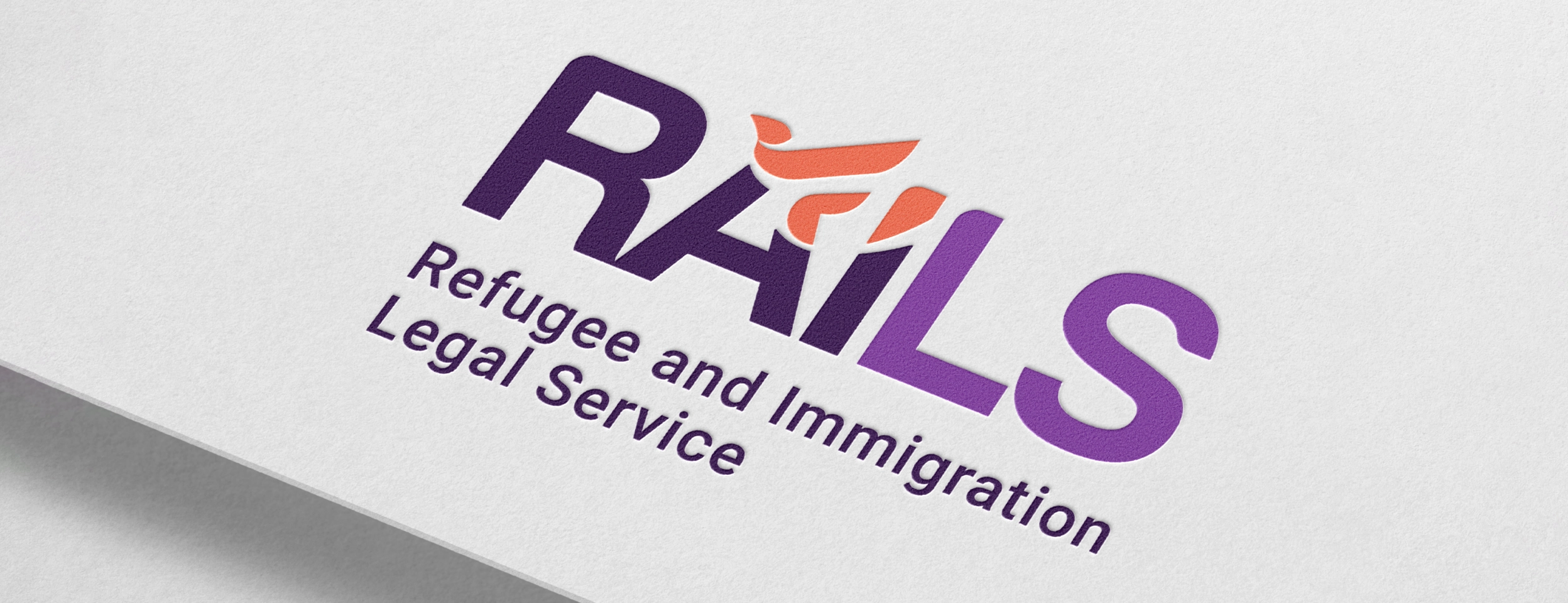
RAILS chose Design 8 — the bird in flight, in full colour.
The final mark features the RAILS lettermark in a deep Royal Purple (Pantone 2695C, Hex #310f45), transitioning to a warm Violet (Pantone 7672C, Hex #773793), with the bird rendered in Coral (Pantone 7625C, Hex #e76248). The result is a mark that feels both authoritative and alive — grounded in purpose, reaching toward possibility.
The tagline Humanitarian Justice anchors the identity, giving voice to the values the visual system expresses.

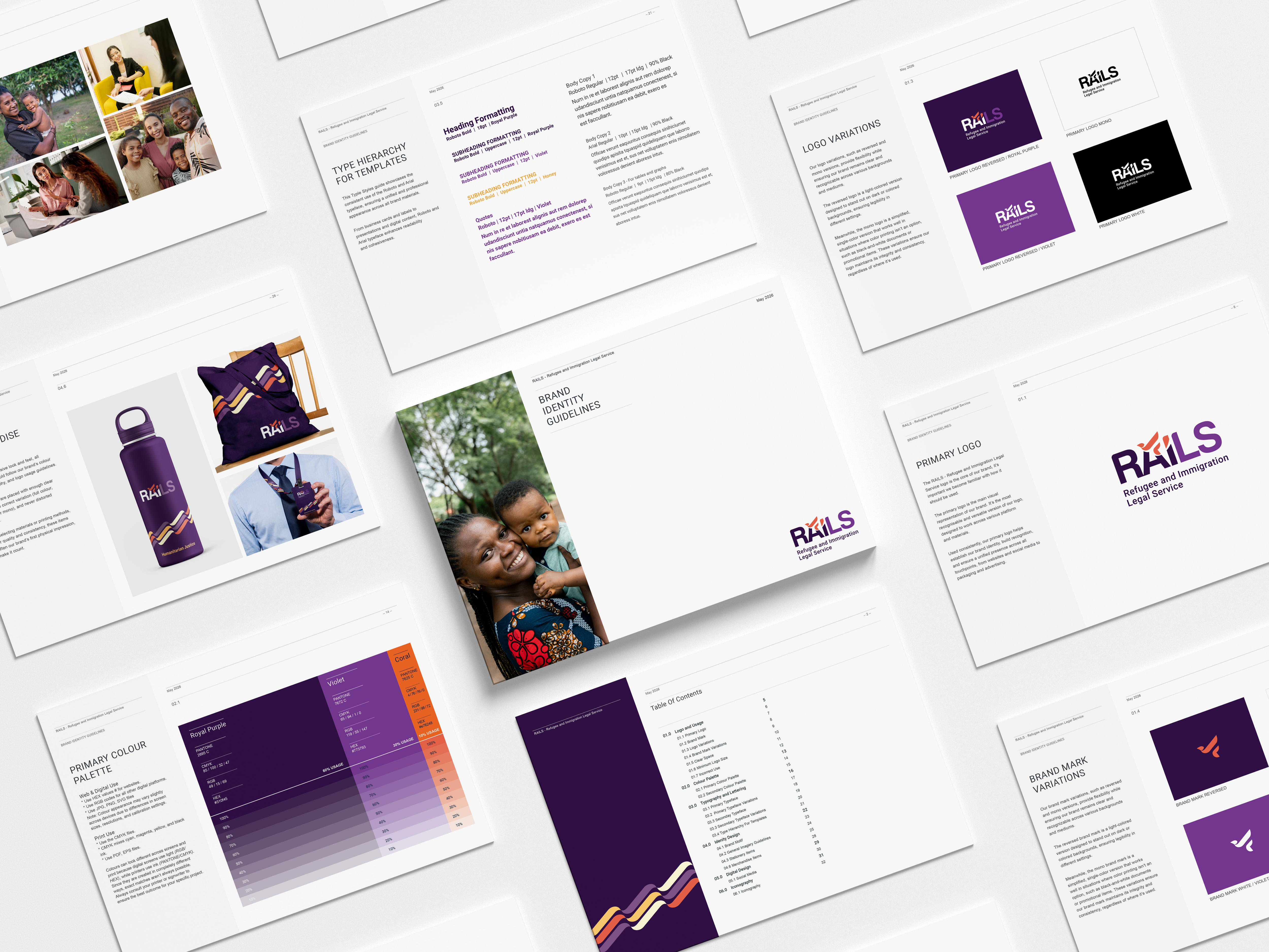
The full brand system
The logo was the foundation, but the brief called for a complete brand identity system — one that would work consistently across every touchpoint from formal legal documentation to LinkedIn banners to branded merchandise.
- Colour palette: The primary palette of Royal Purple, Violet, and Coral is supported by a warm secondary palette — Berry, Soft Putty, Buttercream, Apricot, and Honey — giving the brand flexibility across print and digital applications without losing its distinctive character.
- Typography: Roboto (Google's widely recognised sans-serif) was selected as the primary typeface for its legibility, accessibility, and digital versatility. Arial serves as the secondary typeface — a universal system font that ensures brand consistency even when documents are shared externally without the primary font installed. Both choices were made with multilingual accessibility front of mind.
- Brand motif: Derived from the logo's key symbolic shapes, a flowing wave motif appears across stationery, merchandise, and digital assets — creating cohesion and recognition without the logo needing to appear at full scale everywhere.
- Deliverables included: primary and secondary logo lockups, standalone brand mark, reversed and mono logo variations, full colour palette with Pantone, CMYK, RGB, and HEX values, complete typography system and type hierarchy, iconography suite, letterhead, business cards, email signature, social media profile assets and banners, merchandise guidelines, and a comprehensive brand guidelines document.
Launching on 1 July 2026
The new RAILS brand identity launches on 1 July 2026 — the first day of the new financial year. It's a deliberately symbolic moment: a new chapter for an organisation stepping into a decade of growth, diversification, and deeper impact.
The identity is designed to scale. The brief noted potential future sub-brand architecture for an education arm, ambassador program, and fundraising events — and the visual system has been built with that expansion in mind from day one.
Why this work matters
Brand identity work for purpose-driven organisations goes far beyond aesthetics. The people RAILS serves are navigating some of the most frightening and uncertain experiences a person can face. The organisation that shows up for them deserves to look and feel as capable, credible, and human as it actually is.
Every decision in this project — from the choice of the bird over the star, to the warmth of Coral against the authority of Royal Purple, to the selection of Roboto for its multilingual legibility — was made in service of that mission.
A brand that helps a funder trust RAILS enough to fund them means more legal help for more people. A brand that helps a newly arrived asylum seeker quickly understand that RAILS can assist them in ways that go far beyond design.
That is the kind of impact good brand design can have — and exactly the standard this project was held to.
The Result
Authoritative enough for funders. Human enough for clients. Flexible enough to grow into whatever comes next, that's the brand RAILS launches with on 1 July.
Frequently Asked Questions
- What does a brand identity project for a nonprofit involve?
A full brand identity project typically includes a new logo and brand mark, colour palette, typography system, usage guidelines, and application across key touchpoints like stationery, digital assets, and social media. For organisations like RAILS, it also involves deep strategic thinking about how the brand speaks to multiple audiences simultaneously — from vulnerable clients to government funders. - How long does a brand identity project take?
For a project of this scope — nine logo concepts, a full brand system, and a comprehensive guidelines document — the process typically spans several months, including brief development, concept presentation, client feedback rounds, and final delivery. - What makes a good logo for a community legal centre or nonprofit?
The best logos for nonprofits and community legal services balance authority with humanity. They need to convey credibility and professionalism to funders and partners, while remaining accessible and welcoming for the communities they serve. Avoiding legal clichés (like scales of justice) and crisis imagery is important — the focus should be on capability, hope, and forward movement. - Do you work with nonprofits and community organisations?
Yes. Purpose-driven organisations are some of my favourite clients to work with. If your organisation is ready for a brand that truly reflects the work you do, I'd love to hear from you.
Erica Miller Design is a Brisbane-based brand identity and graphic design studio. To enquire about a project, please get in touch.


