mhi hub is operated by Marathon Health, a registered charity and not-for-profit organisation established in 2015 to address gaps in access to community-based health and wellbeing services for people living in regional, rural, and remote Australia.
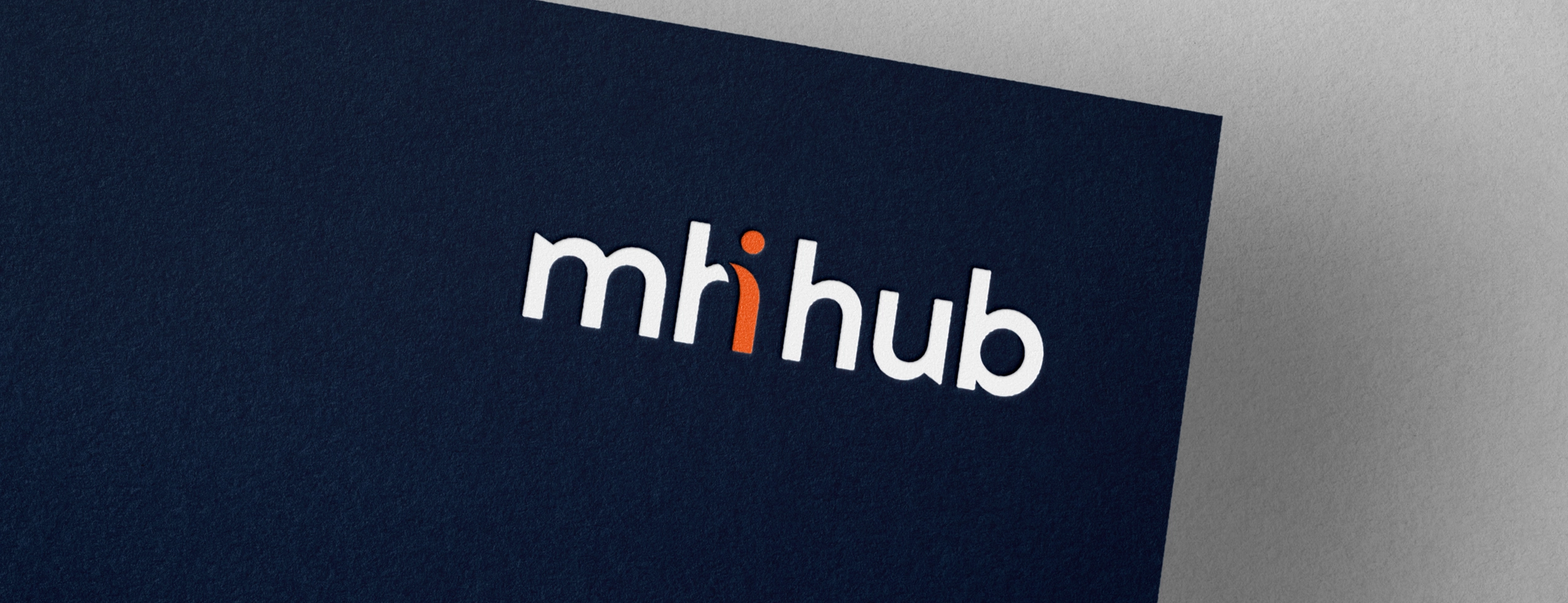
As a subsidiary of Marathon Health, mhi hub required a brand identity that closely aligns with the established Marathon Health brand, while introducing fresh visual elements that reflect the Hub’s innovative direction.
The Brief
- Develop a distinctive brand identity for the Marathon Health Innovation Hub, a movement designed to grow a network of ideas, partnerships, and action across the state and beyond.
- Ensure the brand remains grounded in local communities while being connected through digital platforms.
- Position the Hub as a driver of the future of rural and regional healthcare by incubating bold ideas and translating them into practical, scalable outcomes.
- Reflect Marathon Health’s reputation as a trusted and capable organisation within the rural health landscape.
- Communicate readiness to lead the next era of innovation, investment, partnership, and technology in regional Australia.
The Approach
- Align closely with the established Marathon Health brand while introducing fresh visual elements that reflect the innovative direction of the Hub.
- Retain key brand equity, including the use of lowercase lettering to convey approachability and consistency, while exploring distinctive graphic
elements to symbolise adaptability, unity, and creative flow. - Incorporate curves and fluid shapes to represent flexibility, innovation, and a welcoming, human-centred approach.
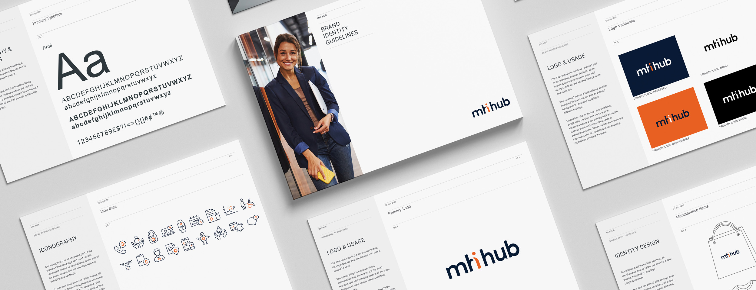
- A strong design focus was placed on the letter “i” as a subtle yet powerful representation of innovation, drawing attention to the forward-thinking
vision while maintaining brand harmony. - The visual direction struck a balance between familiarity and evolution, supporting Marathon Health’s mission while signalling growth and progress.
The Outcome
mhihub’s brand identity provides a confident foundation for launch, enabling meaningful connections with regional and rural communities. The cohesive system establishes a strong platform for future growth and ongoing evolution.
Client Testimonial
"There's something incredibly satisfying about seeing PR and branding strategy step off the page and into the real world."
"Recently, I had one of those moments watching the Marathon Health Australia Innovation Hub come to life, a project we've worked on alongside Erica Miller Design, which was a quiet reminder of why I love what we do.
Because this isn't just branding.
It's not just messaging.
It's a fully realised model designed to shift outcomes in regional Australia - built by Marathon Health with intention, collaboration and a very real understanding of the communities it serves.
From early narrative and positioning through to how this shows up visually and physically in the room... every piece matters.
And when it all aligns? You feel it.
Proud to have played a role in shaping this alongside a team who genuinely care about impact."
Danica Bunch
DanicaB PR, Strategic Communications
Director
Services Provided
- Brand strategy
- Designer logo (primary & secondary )
- Logo variations
- Brand mark
- Curated colour palette
- Typography suite
- Iconography
- Brand style guide
- Website favicon
- Email signature logo
- Social media profile logo
- Social media banner image
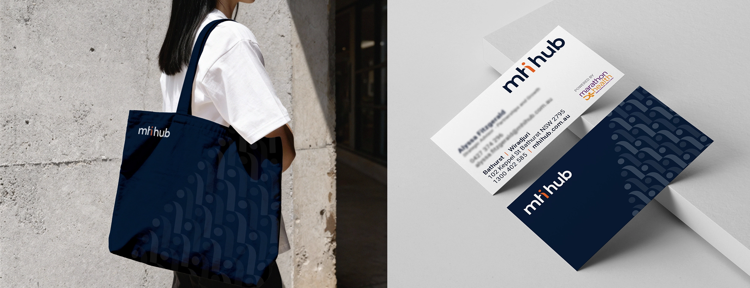
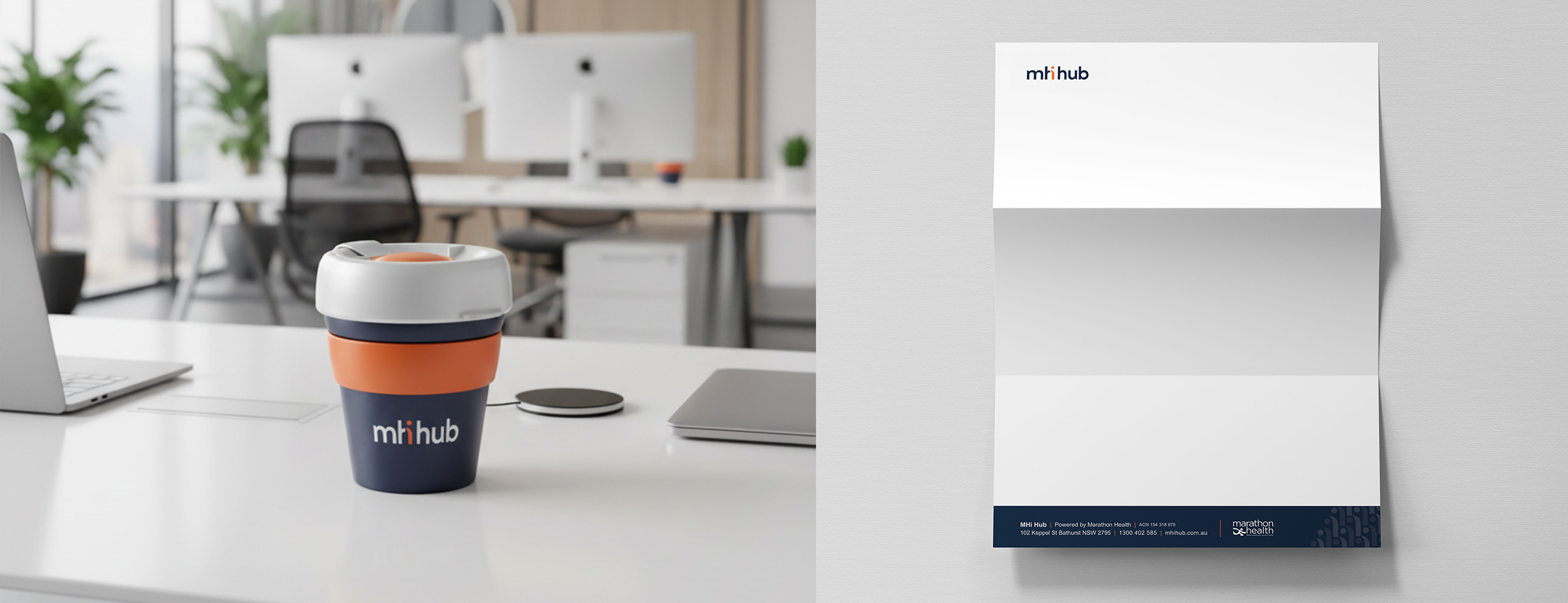
- Letterhead template design
- Business card, appointment card or label
- Final design files (ai, eps, png, jpg, svg & pdf)
The Result
A brand system flexible enough to grow with the Hub, credible enough to open doors, and distinctive enough to be remembered. A genuine platform for what comes next in regional health innovation.
Frequently Asked Questions
- What does a brand identity project for a nonprofit involve?
A full brand identity project typically includes a new logo and brand mark, colour palette, typography system, usage guidelines, and application across key touchpoints like stationery, digital assets, and social media. For organisations like RAILS, it also involves deep strategic thinking about how the brand speaks to multiple audiences simultaneously — from vulnerable clients to government funders. - How long does a brand identity project take?
For a project of this scope — nine logo concepts, a full brand system, and a comprehensive guidelines document — the process typically spans several months, including brief development, concept presentation, client feedback rounds, and final delivery. - What makes a good logo for a community legal centre or nonprofit?
The best logos for nonprofits and community legal services balance authority with humanity. They need to convey credibility and professionalism to funders and partners, while remaining accessible and welcoming for the communities they serve. Avoiding legal clichés (like scales of justice) and crisis imagery is important — the focus should be on capability, hope, and forward movement. - Do you work with nonprofits and community organisations?
Yes. Purpose-driven organisations are some of my favourite clients to work with. If your organisation is ready for a brand that truly reflects the work you do, I'd love to hear from you.
Erica Miller Design is a Brisbane-based brand identity and graphic design studio. To enquire about a project, please get in touch.